You open a feed to watch a reel. An ad sends you to a shop, and a few taps later you can be paying. Renura calls this the economy of motion: the ease of moving from content to consumption.
You open a feed. An advertisement gives you a link. Another app opens, and the next few taps can lead to a payment.
You began by watching. Now you are considering an order. The screens make it easy to move between the two without stopping to ask whether you want the purchase.
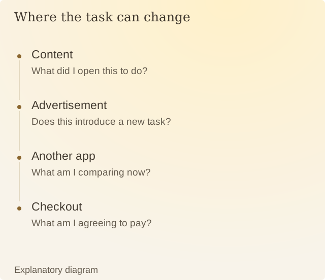
Read the diagram
| Step | Question or meaning |
|---|---|
| Content | What did I open this to do? |
| Advertisement | Does this introduce a new task? |
| Another app | What am I comparing now? |
| Checkout | What am I agreeing to pay? |
Imagine a food video linking to a restaurant’s menu. You see a dish, choose a portion and reach checkout. Your saved address and payment details can make the order quick. You still need to choose whether that meal, arrival time and full price suit you.
We call this the economy of motion. It describes this journey through content, ads and apps. It is Renura’s phrase, rather than the name of a scientific test.
The CMA’s review of online design examines how the layout of screens can shape choices. Look at what appears along your own journey: the offer, the total, any added items and the chance to go back.
Convenience can help you finish an order you already wanted. The same quick steps can carry you toward something you had no plan to buy when you opened the feed.
Renura offers a pause, right there while you use the app. A moment to choose. You can continue, change the order or step away.
Sources
CMA: Evidence review of online choice architectureResearch review, 2022. Examines interface practices. Renura-specific effects are outside its scope.