Check the actual item, version, quantity, address, full total and any recurring commitment. Use the final summary rather than relying on details seen earlier.
Read the current order. Earlier screens may describe a basket you have since changed.
Imagine a fictional order for one phone case. A promotion adds a second case; the saved address points to a former home; the delivery charge updates after postcode entry. The product image still looks familiar. The actual order now differs in three ways.
Check the details you can still change: the model, colour, size, quantity, recipient and delivery method. Then inspect the payment amount and whether it applies once or repeats. A button saying “Continue” can lead to another review or place the order, depending on the interface.
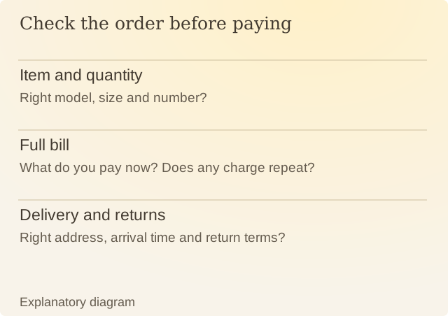
Read the diagram
| Item | Question or meaning |
|---|---|
| Item and quantity | Right model, size and number? |
| Full bill | What do you pay now? Does any charge repeat? |
| Delivery and returns | Right address, arrival time and return terms? |
The FTC’s dark-patterns report examines designs that obscure terms or insert unwanted items. A final review helps show what is in the basket, but it cannot compensate for terms the seller still withholds.
Keep the ability to change details visible. If correcting a quantity invalidates a coupon, the revised total needs review again. A confirmation screen that only shows an attractive product picture leaves important checks elsewhere.
After ordering, retain the summary and confirmation. They record what you agreed to and help explain later differences. Checking before payment gives you the chance to fix a wrong address or quantity before the order goes through.
Sources
FTC: Bringing Dark Patterns to LightUS staff report, 2022. Examples of interface practices; local rules vary.